Citizen science · Evidence
What I Learned from Analysing 80,000 Hourly Benzene Measurements
Grain, missingness, reference levels and dataset versions matter as much as the chart—especially when evidence enters public debate.
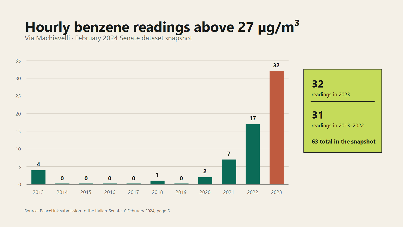
For the February 2024 Senate hearing, PeaceLink asked me to examine all the hourly benzene measurements from the Via Machiavelli monitoring station in Taranto across 2013–2023.
The dataset contained more than 80,000 observations, but volume was not the difficult part. I had to decide what the measurements could support, preserve the hourly events that annual summaries hide, and make the result clear enough to enter a public and institutional discussion without making it sound more certain than it was.
The analysis was later presented by Alessandro Marescotti during an Italian Senate hearing on 6 February 2024. The official slides credit my data analysis and processing with Omniscope. This is the result and an account of the decisions I had to make before those numbers could be presented.
Hourly grain changes the question
Benzene regulation and public reporting often focus on annual averages. Those are essential for assessing long-term ambient concentrations and legal compliance.
An annual mean cannot describe the shape of every hour inside it. Two years can have the same annual average while one contains a relatively stable distribution and the other contains short, extreme episodes. People living near a monitoring station experience both patterns, but the analytical questions are different. I needed the station’s annual mean, but I also needed to know how often unusually high hours occurred, whether they clustered in particular months or times, whether the distribution changed and whether data was missing during an event somebody wanted to examine.
Those questions disappear if the hourly rows are aggregated too early. I kept the finest trustworthy series and derived the summaries from it.
A threshold needs a name and a meaning
For the hourly analysis, PeaceLink used 27 µg/m³ as a reference.
That value comes from the California Office of Environmental Health Hazard Assessment’s acute Reference Exposure Level for benzene. It describes a one-hour airborne concentration not anticipated to cause adverse non-cancer effects for that exposure duration.
The wording matters:
- it is a health-based acute reference level;
- it is designed for infrequent one-hour exposure;
- it is not an Italian or EU ambient legal limit;
- exceeding it is not automatic proof of individual harm;
- exceeding it is not, by itself, proof of a legal breach or source.
The EU ambient benzene limit under Directive 2008/50/EC is expressed as an annual mean. The recast Directive (EU) 2024/2881 sets a tighter annual value to be attained by 2030.
An hourly 27 µg/m³ event and an annual 5 or 3.4 µg/m³ limit cannot be compared as if they were interchangeable thresholds. Different averaging periods answer different health and legal questions.
Whenever an alert or chart draws a line, the line should carry its source, duration and status.
What the February 2024 snapshot showed
In the dataset snapshot analysed for the Senate hearing, the Via Machiavelli series contained 63 hourly observations above 27 µg/m³.
Their yearly distribution was:
| Year | Hourly readings above 27 µg/m³ |
|---|---|
| 2013 | 4 |
| 2014–2017 | 0 |
| 2018 | 1 |
| 2019 | 0 |
| 2020 | 2 |
| 2021 | 7 |
| 2022 | 17 |
| 2023 | 32 |
| Total | 63 |
These counts appear on page 5 of PeaceLink’s Senate submission.
The striking finding was the concentration in the latest year of that snapshot: 32 in 2023, compared with 31 across the previous ten years combined. That justified attention, but the count alone did not identify a cause.
Time, wind direction, other stations, industrial operations and validated source records all become relevant to a causal investigation. A single monitoring series can show when and where a pattern deserves examination. It cannot close every explanatory question.
The final ARPA report used a more complete series
The February hearing used the public data available at the time. That series was incomplete, and the Omniscope result—32 Via Machiavelli observations above 27 µg/m³ in 2023—correctly described the records available for analysis.
The later final ARPA Puglia 2023 benzene report records 47 observations above 27 µg/m³ for the same station. Its 2023 series was more complete. The difference came from the state of the public source data, rather than the Omniscope calculation.
This makes one requirement impossible to ignore:
A result is not fully described by the query. It also needs the source snapshot and its date.
Anyone citing the 63/32 result should describe it as the public dataset available for the February 2024 hearing and include its extraction date. The final 2023 ARPA report should be cited for the final annual count. The earlier analysis remains valid for the data available at that point.
Missingness is evidence too
Public environmental datasets contain gaps, station outages, delayed validation and revised records. For each period I want to know how many hours should exist, how many measurements are present and whether a gap is isolated or continuous. I also check whether values are provisional or validated, timestamps and daylight-saving changes were handled consistently, duplicates exist, units changed and when the source file was retrieved.
A line chart that connects across a three-day gap can visually imply continuous monitoring. An annual summary can hide that the station was absent during an event somebody wants to investigate.
Absence does not prove why data is missing. It does affect what the available data can support.
A peak and a trend can both be true
Later analysis across 2023–2025 showed a reduction in the number and average of high daily benzene readings at several Taranto stations, particularly around Tamburi.
At the same time, later hourly episodes still exceeded the 27 µg/m³ acute reference.
Longer-term improvement can coexist with individual events that deserve attention. The 2023–2025 direction and the later hourly episodes describe different parts of the same record, and neither should be dropped to make the story simpler.
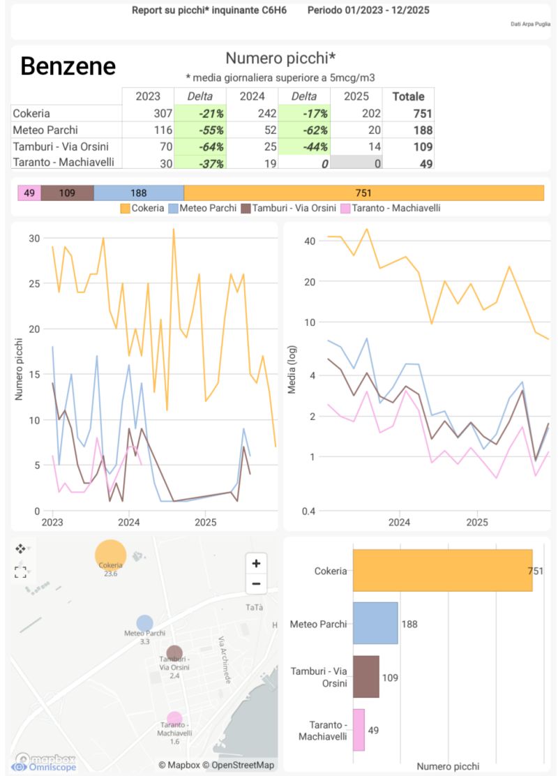
The distinction between hourly and daily measures belongs in the caption, not in a footnote nobody reads.
What stayed attached when the analysis travelled
The source monitoring records became a prepared and checked hourly dataset, an Omniscope workflow and report, charts and threshold counts, PeaceLink’s public explanation and finally the Senate slides. At every hand-off some context could have disappeared.
We kept the raw observations available, showed the distribution by year, named the threshold and stated the station and period. The method could be rerun, later data could be compared and the limits of causal attribution remained explicit. Those details kept the chart connected to the analysis behind it when it reached a different audience.
What I would preserve in the next analysis
For any long-running environmental series, I would now keep:
- the original downloaded files;
- retrieval time and source URL;
- file checksum where practical;
- validation or provisional status;
- normalised UTC and local timestamps;
- unit and averaging period;
- missingness report;
- transformation version;
- threshold definition and source;
- result snapshot used for each publication;
- links from every public claim back to the interactive report and source rows.
I would also reconcile later official revisions explicitly rather than silently updating an old number.
What the 80,000 measurements taught me
“More than 80,000 measurements” communicates scale, while “63 above the reference” communicates a finding from one snapshot. The conclusion also depends on grain, coverage, threshold meaning, version, comparison and the limits of attribution. It includes the later official count that does not match the earlier snapshot. It includes the fact that trends can improve while significant episodes continue.
That is less tidy than one permanent headline, but it is an honest account of what the data can support.