Citizen science · Public data
Making Institutional Air-Quality Data Usable by Citizens
Publishing a file is not the same as giving people an instrument for comparison, investigation and public evidence.
In January 2019 I published “Air pollution: looking after my hometown”. The work had started over Christmas, when Led Zeppelin’s “Good Times Bad Times” appeared in a Spotify playlist and reminded me that I had spent years building skills and software I could use for something beyond my day job.
My hometown is Taranto, in Puglia: a beautiful city by the sea, living beside one of Europe’s largest industrial sites and with the impossible argument of “health versus jobs” hanging over its citizens.
ARPA Puglia, the regional environmental agency, was already publishing validated monitoring data. It was public, but using it still required somebody to find the right files, understand the fields, combine dates, compare stations and create charts. “Available for download” and “available to citizens” were not the same thing.
I was living in London and building Omniscope with the Visokio team. I could contribute the software and skills I already had: a public report where people could examine the measurements without first becoming data engineers.
Public is not the same as usable
Open-data programmes often measure success at publication.
A file appears on a website. A licence permits reuse. The obligation is met.
That is necessary and valuable. It is not the end of accessibility.
For a citizen trying to understand the air around their home, publication leaves many practical questions unanswered. They still need to find the nearest station, see which pollutants it measures, compare a value with the station’s history or another neighbourhood, notice missing measurements, distinguish hourly from daily and annual data, check the last update and reach the rows behind a chart.
If each question requires a new spreadsheet, script or expert, the data is open in principle and restricted in practice.
The first report
I used Omniscope to build a public report around the ARPA Puglia records.
The first version had five complementary ways to examine the same data:
- Summary — an overview of pollutant concentrations and current context;
- Pollutant — the history and distribution of a selected measure;
- Station — all available pollutants from one monitoring location;
- Distribution — comparisons that did not reduce every period to one average;
- Raw data — the observations behind the visualisations.
The five views did different jobs. The summary offered orientation, while the pollutant and station views supported investigation. Distributions exposed spread and unusual observations. Raw rows kept the visual claims connected to the source.
I later added comparison views, extended the history back to January 2016 and published an Italian version.
Localisation was not decoration. An English analytical interface for an Italian civic audience would have preserved an avoidable barrier.
The missing-data moment
At 10:30pm on 2 November 2018, I had photographed orange clouds glowing near the industrial area: a sort of hellish Mad Max scene and a sweet “welcome home”. Later, while building the report, I tried to inspect the corresponding PAH measurements from the Cokeria and Tamburi stations.
The observations were absent between 2 and 4 November 2018.
I did not know why they were absent and did not claim that anybody had deliberately withheld them. We had simply lost the opportunity to examine what happened during those hours. If a chart quietly connects the points on either side, a citizen may never notice that the station was missing.
The report therefore needs to show expected and available coverage, outages, provisional or validated status, refresh time and breaks in the series. A gap changes which questions the remaining measurements can answer.
Comparison turns values into context
A measurement in isolation is difficult to interpret. I wanted people to be able to compare the same station over time, nearby stations during the same period, neighbourhoods at different distances from the industrial site, weekdays and weekends, wind direction and speed, and the full distribution instead of seeing only one mean.
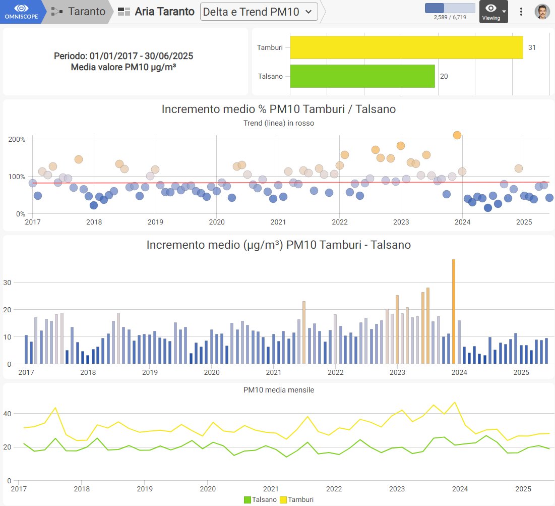
The PM10 comparison between Tamburi and Talsano across 2017–June 2025 is one example. It lets a citizen examine relative differences, monthly changes and longer-term trends in the same report.
Comparison still requires discipline. A difference between stations does not automatically identify its cause. Monitors may have different local conditions, coverage and surroundings. Weather and other sources matter.
The report should make the relationship visible and leave causal attribution open to proper investigation.
Exploration should preserve uncertainty
An earlier analysis examined black-carbon readings alongside wind direction and speed.
Lower readings under stronger northerly winds could be consistent with dispersion. They could also reflect another factor or a limitation in the available monitoring.
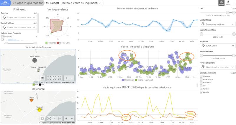
This is a feature of interactive analysis: people can move beyond the headline and test whether a pattern survives a different filter, period or station.
The interface should encourage that curiosity rather than presenting every visual association as a conclusion.
Citizens began using the instrument
The most important validation was not page traffic. It was use.
On 22 February 2019, PeaceLink described four students using Omniscope to compare ARPA monitoring data in an environmental-education activity. The classroom account called the work environmental data democratisation.
Students did not need to reproduce my ingestion and preparation before asking questions. They could begin with the comparison.
PeaceLink later used the reporting system in its own citizen-science activity. Its 2024 account of the project explains the practical benefit: citizens no longer had to download repeated files and construct complex spreadsheets before comparing hourly information.
That classroom use was a better test of usability than page traffic. I had done the ingestion and preparation once, and the students could begin with their questions.
From historical files to automatic alerts
The first report was mainly a way to explore validated historical files.
I later added automated refresh, hourly benzene monitoring, threshold detection, report screenshots and public alerts with direct links back to the interactive reports. Longer-term multi-station comparisons and reproducible historical analysis grew from the same project.
The report could now detect a defined condition and bring it to public attention, instead of waiting for somebody to download another file and start the analysis again.
The Aria Taranto report and historical benzene report now sit behind the public alert channel. The alert creates immediacy. The report retains time, station, history and comparison.
The next article in this series examines how to design that alert without separating the claim from its evidence.
The work entered a wider civic record
The accessible report became part of a collaboration with Alessandro Marescotti, PeaceLink and local citizens.
For the February 2024 Senate hearing, we examined more than 80,000 hourly benzene observations from Via Machiavelli. PeaceLink presented the resulting evidence during the hearing on ILVA.
The analysis, including the public source available for the February hearing and the more complete series used in ARPA’s final 2023 report, is documented in What I learned from analysing 80,000 hourly benzene measurements.
The project worked because automation and people did different jobs. Omniscope supplied timely, repeatable analysis; people in Taranto contributed local observation, interpretation, communication and persistence. Institutions retained their scientific and legal responsibilities.
A practical definition of usable public evidence
For institutional air-quality data, I now look for these properties:
- Source — identify the agency, dataset and retrieval time.
- Grain — state whether values are hourly, daily or annual.
- Coverage — expose missing periods and station availability.
- Units — preserve the measure and averaging duration.
- Context — provide history and relevant comparisons.
- Raw observations — let people inspect what supports the chart.
- Language — communicate in the language of the intended community.
- Update state — show when the report last refreshed.
- Reference definitions — distinguish health guidance from legal limits.
- Caution — separate an observed relationship from causal proof.
These are not advanced visualisation features. They are conditions for public understanding.
Make the path shorter
Software cannot remove pollution, make policy, replace regulatory monitoring or settle scientific attribution. My contribution in 2019 was more modest: I turned published measurements into comparisons that people could use directly, ask questions about and take into public discussion. That is still what I want the report to do.