Analytics platforms · Coherence
Why Data Preparation, Analytics and Reporting Belong Together
A report is easier to trust when the preparation, analytical logic and final claim can still be followed in one project.
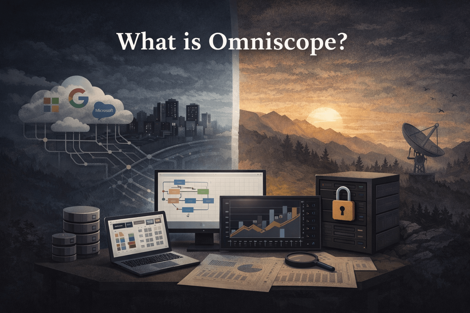
In February 2026 I received almost exactly the same feedback twice on the same day, once from a customer and once from a prospect working on a completely different problem:
Antonio, I did not understand what Omniscope was from the website. After you showed me, I finally get it. Why is everybody not already using this?
That hurts a bit. We have spent more than twenty years building Omniscope, bootstrapped and working with real organisations, but its biggest strength is also difficult to explain: it does not fit neatly into one software category. It prepares data, analyses it, builds reports, automates workflows and delivers applications. A “tool made of tools” becomes obvious when somebody sees the whole job running, but it is awkward to fit into a familiar box on a website.
The categories are narrower than the work. A customer metric begins in source records, passes through cleaning and definitions, becomes an analysis, appears as a claim and may finally trigger an action. Different people and systems may own parts of that path, but the meaning has to survive all of them. That is why I believe data preparation, analytics and reporting belong together.
The report begins before the chart
Consider a chart showing customer churn by segment. Before anybody draws a bar, somebody has decided which event counts as churn, how reactivations are treated, whether the population contains accounts, contracts or users, which date puts a record into a month, how the segments are derived, whether internal accounts are removed and what happens when source data arrives late.
The report is where those decisions become visible to a wider audience. If it is treated as decoration added after the data work, the person reading the chart has little chance of seeing which definition produced it.
When the chart and its preparation live in separate worlds, the person looking at the chart often sees only the final label. The person changing the transformation may not see how that change alters the claim.
I built a small Omniscope demo around a less glamorous version of the same problem: operational files where columns change name, dates arrive in five formats and a few broken rows can stop the pipeline. The workflow ingested, modelled and validated the data, then showed the result interactively. Because the preparation and report were in the same project, I could see immediately how a repair changed the output instead of passing another file to another tool.
Every hand-off creates a translation
Using several products is not automatically a problem. The risk appears in the translations between them.
| Hand-off | What can be lost |
|---|---|
| Source to preparation script | field meaning, freshness and source-system quirks |
| Prepared table to analysis | exclusions, deduplication rules and grain |
| Analysis to BI model | formulae, parameter choices and uncertainty |
| BI model to presentation | filter state, comparison period and caveats |
| Presentation to scheduled delivery | refresh status, failures and version used |
Each step may create another copy. Two copies begin equal and then acquire different filters, fixes or business rules.
Eventually, people ask why the warehouse total, notebook result and dashboard number disagree. All three may be internally consistent. They are simply answering slightly different questions.
Coherence is more important than “all in one”
The argument for integration can easily become a feature list:
It connects files, transforms data, runs analytics, draws charts and schedules reports.
Those capabilities are useful because they share a project. I can inspect the output of a transformation immediately, follow a chart back to the field and workflow that produced it, and show a quality warning beside the affected result. One parameter can control both preparation and presentation. If an exploratory method proves useful, the same implementation can be scheduled; when a source changes, it can be tested against the report it will affect.
Different roles should see different levels
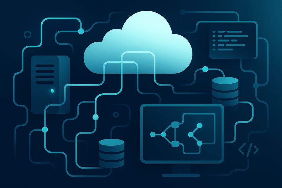
Each role can work at the level it needs over the same project. A data engineer may care about source contracts, performance and execution logs. An analyst works with fields, calculations and comparisons. A business user may see only the report and a few controlled parameters.
That is a better form of self-service than asking every user to recreate a private version. People can do their part without hiding another copy of the logic.
The feedback loop becomes much shorter
Data preparation improves when the person doing it can see the analytical effect. Suppose a profiler reports that 8% of a revenue field is missing. That may be harmless noise or it may remove most of one region or month and distort the trend. Seeing the report beside the quality result turns the warning into something the analyst can investigate.
The feedback also runs the other way. A strange chart may expose a failed type conversion, a join explosion, a source-system code change, a missing date range or a duplicate batch. In the messy-data demonstration, the interactive output was part of the debugging process, not a presentation prepared after the pipeline was considered finished.
Reuse the logic across modes
Analytical work often moves through several modes:
explore
  → explain
  → repeat
  → publish
  → operate
The first version may be an analyst investigating a file. If the result proves useful, it becomes a report; a parameter lets another team use it; a schedule refreshes it; an API triggers it from an application; and a quality gate stops a bad run being published.
If each transition requires a rewrite into another tool, the risk and cost are large. The person closest to the original reasoning gradually loses influence over the operated version.
Keeping the layers together lets the same project acquire those operational controls while the original reasoning remains available to inspect.
Integration should not become isolation
A coherent platform still needs interfaces. Data may belong in a warehouse, a specialised model may run in Python and a transactional application may own customer state. Another product may consume the result through an API, and a corporate BI standard may remain the right presentation layer for some teams.
Omniscope can publish data onwards, call and expose APIs, host custom mini-apps, and be embedded in other applications. That openness prevents the integrated project becoming a monolith. When I choose a boundary, I ask:
Does this boundary preserve meaning and ownership, or does it create an unexplained copy?
A clear API contract gives both sides something to test. Exporting
final_v7_really_final.csv to somebody’s desktop gives us another mystery to
solve later.
When separation is the better choice
I would not consolidate simply to reduce the tool count. Separation may be correct when an organisation already has a strong warehouse semantic layer, a specialist engine materially outperforms general tooling, or different teams have clear ownership and reliable contracts. Independent scaling, deployment or regulatory requirements can also justify it. In those cases I want the hand-offs to be automated, tested and observable.
The complete path to the decision must remain understandable even when several products own different parts of it.
Integration still needs good practice
Putting every stage in one place can also make bad logic easier to reproduce. The team still needs owners for metrics and sources, validation and review, appropriate permissions, release discipline and documentation where the workflow cannot explain enough. Integration removes some accidental friction; it does not make those decisions for the team.
That responsibility caveat is central to the current description of Omniscope. That article is deliberately candid about the trade-off: ownership gives an organisation more control, and it gives the organisation more work to own.
Follow the claim backwards
A useful test for any analytics stack is to start with a sentence in the final report and follow it backwards.
Can you identify:
- the chart state and filters;
- the metric definition;
- the analytical calculation;
- the prepared fields;
- the quality checks;
- the source records and refresh;
- the version of logic that ran?
The path may cross several tools. I care that it remains possible to follow. In the messy operational-data project, a renamed column or malformed date could be inspected in the workflow, seen in the validation result and checked against the final report without recreating the investigation elsewhere.
That is the practical meaning of keeping preparation, analytics and reporting together: when somebody questions the result, the work that produced it is still there.